Visualizing U.S. Carbon Intensity: 1990-2015
Background
I used to be an energy and policy analyst, on both the client and consulting sides. I spent a lot of time analyzing the electricity sector, including forecasting carbon dioxide emissions. This, at one point in time, was very relevant at the national level. Former President Barack Obama made climate change a legacy issue, pushing through initiatives like the Clean Power Plan (domestic policy) and the 2015 Paris Climate Agreement (international). Businesses cared about these and other policies as they could create risks and opportunities for existing and future investments.
Although I'm no longer an energy analyst, I enjoy thinking about energy and policy, particularly how I might visualize previous work. (I'm currently freelancing, helping small businesses and startups with strategy, marketing, and web analytics.) In the remainder of this post, I display a series of visualizations of U.S. carbon intensity by state over time.
Methodology
In my previous roles, I loved jamming as much information as possible into my Excel charts. I was pretty good at making them dense, yet understandable and informative. I could "animate" the data using PowerPoint transitions, which worked well for conferences and meetings. For this post, I used R's ggplot2, tweenr, and Shiny packages. I then used Giphy to capture/screenshot my Shiny Apps. I opted for this route because I'm familiar with both ggplot2 and Shiny. I've see some pretty awesome animations that use Image Magick, so if anyone has experience with that, please let me know!
Some definitions and explanations might be useful to understand the rest of this post. Power plants produce electricity for end consumers (like us to charge our devices and light our homes). Depending on the fuel source for the electricity, a power plant might also create carbon dioxide emissions, which contribute to climate change. Rather than look at the absolute level of carbon dioxide emissions, I'm analyzing the rate of emissions relative to the amount of electricity generated, or carbon intensity. Instead of analyzing the U.S. in aggregate, I'm looking at each state individually.
The first chart is similar to something I would have created in Excel, except that it would have been static. If someone were interested in each state's carbon intensity over time (like I am), he or she might have an issue plotting 51 (i.e., including D.C.) separate lines on a single chart. What I did below is plot each state's carbon intensity, between 1990 and 2015. The red line corresponds to a single state, and transitions among the states in alphabetical order. The non-moving black line is the U.S. average during the same timeframe. In general, most states' carbon intensities are declining over time, which you might be able to see from the declining U.S. average.
Figure 1: Carbon Intensities Declining Over Time - State-by-State Line Chart
Data Source: EIA
Created with R (ggplot2 and Shiny), Giphy
Note: Only thru Hawaii
Line charts are great for time series data. They might not be great if you have a lot of elements you want to analyze, like 50 states plus D.C. Maps can solve that problem, but every solution may also come with its own problems. A static map would only show a snapshot in time. I created a map of each state (minus Alaska and Hawaii), transitioning from year-to-year. Black corresponds to a "high" carbon intensity (for those who are interested, high is greater than or equal to 1.0 MtCO2e/MWh), grey correspond to "medium" (0.5 MtCO2e/MWh), and lightest blue corresponds to "lowest" (approaching 0.0 MtCO2e/MWh).
Figure 2: Coastal States with the Lowest Carbon Intensities - State-by-State Map
Data Source: EIA
Created with R (ggplot2 and Shiny), Giphy
What might be immediately evident is that even though the U.S. average is declining over time, each state's carbon intensity is changing at different rates. There also appears to be pockets of high or low carbon intensities.
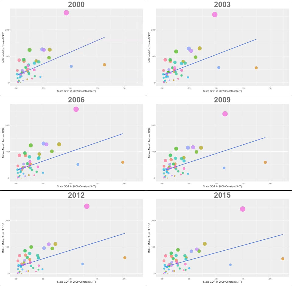
A separate issue that arises is due to my choice of statistic: carbon intensity. Specifically, a rate does not necessarily convey magnitude. So, I created a scatter plot below, with each state's GDP plotted against the absolute level of carbon dioxide emissions. The size of each bubble corresponds to the level of electricity generation. Embedded into this chart is carbon intensity, except it's less obvious (height of bubble divided by size of bubble equals carbon intensity). Like the map above, I'm transitioning through years (2000-2015). The blue line is a linear smoothing of all states, or a simple trend line.
Figure 3: States' Economies Growing Yet Emissions Capping
Data Source: EIA, St. Louis Fed
Created with R (ggplot2 and Shiny), Giphy
What I find interesting about this chart is that states' economies are growing (moving along the x-axis), yet the absolute level of emissions more or less flatline (not moving upwards by as much). A simple way to see this is that the blue line extends outwards instead of upwards.
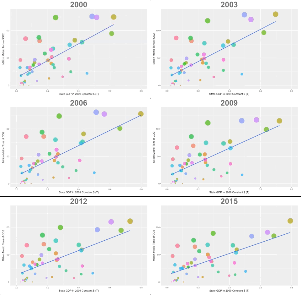
The blue line above may be sensitive to outliers. Visually, it looks like there could be three: the right most orange bubble is California, the upper most pink bubble is Texas, and the blue bubble just about directly below Texas is New York. In the plot below, I've removed these three states. It looks like these remaining 48 states do not share the same trend as the other three, which is growing economies but flatlining emissions. This trend does not surface until after the 2008-09 recession.
Figure 4: States Other Than CA, NY, TX Reducing Emissions After Recession
Data Source: EIA, St. Louis Fed
Created with R (ggplot2 and Shiny), Giphy
Final Thoughts
There are many ways to analyze things, including choosing key metrics and types of visualizations. My focus in this post was how to visualize data. With more time, I could delve into the actionable insights (e.g., which states might have the greatest investment upside for renewables). Like my previous post (link below), I could have created a functional Shiny App so that users could choose their own settings and metrics to analyze. I plan on installing Image Magick at some point, or something else, to create smoother animations.
You can find the R code and data on my Git.


